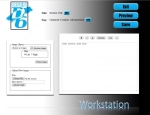
Recently the web developer who is working for Eric Gibson to create the OpenD6 website revealed not only the OpenD6 logo but also posted an early screenshot of the OpenD6 website. The logo is ok-ish, although I don’t really like the color.
 The details on how the OpenD6 site should work are pretty interesting, but again the look of the site is pretty underwhelming. Especially the 3D buttons and the gradient background is reminding me of early ’90s webdesign. I hope this is just some very early version, and they’ll make some changes to it. Yuck!
You can follow the development of the OpenD6 site on the Falcon Hat Web Development Blog.


Is it me or does the OpenD6 Logo have some kind of similarity to the White Wolf Logo? o_O Maybe it's just the colors…
.-= Markus´s last blog ..Japantag 2009 =-.
Hmm, it has some similarities…
<img src="https://www.stargazersworld.com/wordpress/wp-content/uploads/2009/06/white-wolf-logo.gif">
<img src="https://www.stargazersworld.com/wordpress/wp-content/uploads/2009/06/od6logo1.jpg">
Not digging the logo. Get rid of the black box and changed the color to something other than cyan. Comparing to White Wolf logo, D6 comes up short.
I agree, although I am happy that OpenD6 finally even has a logo. For a long time the project seemed dead like a doornail. Even a less than perfect logo is better than nothing.
The logo is astonishingly bad, if you ask me. The crayon swoosh adds nothing, conveys nothing, and is just trying to conceal how boring the logo is; it almost looks as if it came from some generic logo template where you just replace the text with the name of your company. You'd think with the concepts of openness and a d6 to work with, the designer could have come up with something that communicated more than the name. Fie upon it!
.-= Joshua´s last blog ..Chgowiz Quiz =-.
The main problem is obviously that a) West End Games and Eric Gibson don't have enough money to pay a good designer and b) he fears to make use of his fanbase. I am pretty sure a OpenD6 logo contest would have produced a much better result.
I am also sure that if OpenD6 was a 100% fan-driven project the website would have been up for months already and much better looking that the trainwreck of mockup the designer posted at his blog.
WEG and the OpenD6 project are more or less a one-man-show. And in the long run this will probably hurt the whole OpenD6 idea.
Where can one find the rules for this OpenD6 system? I'd like to give it a once-over.
Also, going to have to agree with the naysayers regarding the logo design. It's rather unimpressive.
.-= Christopher Pye´s last blog ..Radical’s Handbook and Rouge Trader News =-.
The OpenD6 rules aren't available yet. You will have to wait until the actual site goes online.