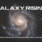
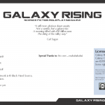
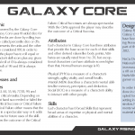
Yesterday I spent several hours to work on the layout of my NaGa DeMon project Galaxy Rising. It’s already November 21 and when I want to get the game to a playable state, I have to focus on getting the rules done and into PDF form right now. One important part of game design for me is to make the game good-looking. Sure, you can run a game that only exists as a couple of notes on a scrap of paper, but that’s not enough for me. Below I have posted a couple of images that should give you a good impression of what Galaxy Rising might look when done.
So, what do you think about the layout so far? As always, your comments are highly appreciated! You can check out the layout draft in PDF format here.


I like the clean simplicity, and I quickly got used to the landscape layout. I get a bit of a Traveller vibe. I’m looking forward to the complete version!
Love the layout. Great work.