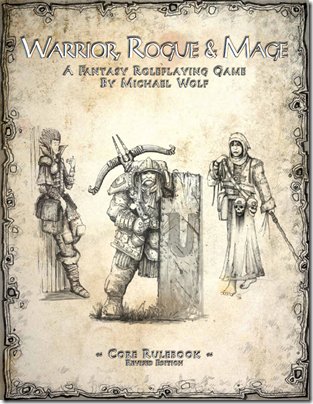
Today I want to tease you a bit more with updates from the upcoming revised edition of the Warrior, Rogue & Mage roleplaying game. Initially I wanted to use a cover featuring artwork created by fellow RPG blogger Greywulf, but when I started adding the interior artwork, it didn’t really fit anymore. I want to use this opportunity again to thank him for providing me with some great artwork. I will make sure I put it to good use in a later project!
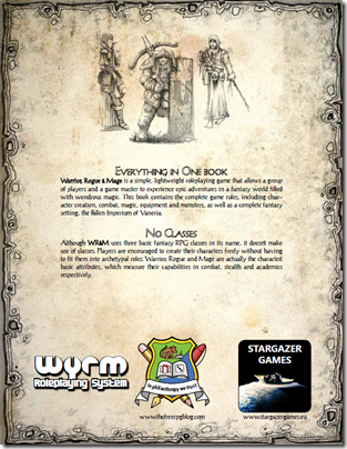
Now let’s have a look at the new cover and back cover:
 |
 |
You’ll probably notice the “wyrm Roleplaying System” logo on the back cover. That’s what I decided to call the underlying rules system which I want to use in at least a SF game as well. Why “wyrm”? You have to thank Firlefanz, a regular on the #rpmn IRC channel for that. Whenever we wrote WR&M she read “wyrm” for some reason. And so the name stuck. I also like how the Y in the logo looks a bit like a wrench. That fits well with the toolbox nature of the system, if you ask me.
My friend Andrew Modro is currently working on the final editing pass on WR&M. And as soon as he’s happy with the result, the game will be released! So stay tuned!

Wow… that looks really great. I love the new cover – I didn't really think that the digital art fit the game, but this certainly does.
Looking forward to the final product!
It’s been great working on this. I’m glad we finished in time for GenCon, and I’m really looking forward to being able to hold a copy of it in my hands.
Wow, this looks awesome! The cover really works for me!
This looks fantastic! I can't wait to see the finished product. 🙂
Really really really nice! And this is an understatement. That cover sets the mood. Congratulations!
That looks really awesome!
I rate it Awesome+++!
I absolutely LOVE that cover! It looks great!
Agreed! That cover looks superb and really sets the mood perfectly. Good design decision 🙂
If you don't find a use for the one I made later, let me know and I'll put together something else for you when you need it, 'kay?
Thanks for the kind words, everyone!
I'm behind on this.. but I wanted to chime in and say it looks pretty darn neat. Looking forward to giving it a looking through.