Wednesday post for #RPGaDay2017. We’re in Europe territory now… The Final Countdown!
Ok, you’re not here for the lame jokes, but for today’s question, which is:
August 23: Which RPG has the most jaw-dropping layout?
Jaw-dropping is such a strong concept. I associate it with something truly extraordinary, and RPGs have really come far from the early days, it is amazing. And there are some notable examples of amazing layout.
Take the books by Modiphius Entertainment. Their books rarely disappoint Look at a sample page from the new Star Trek RPG.
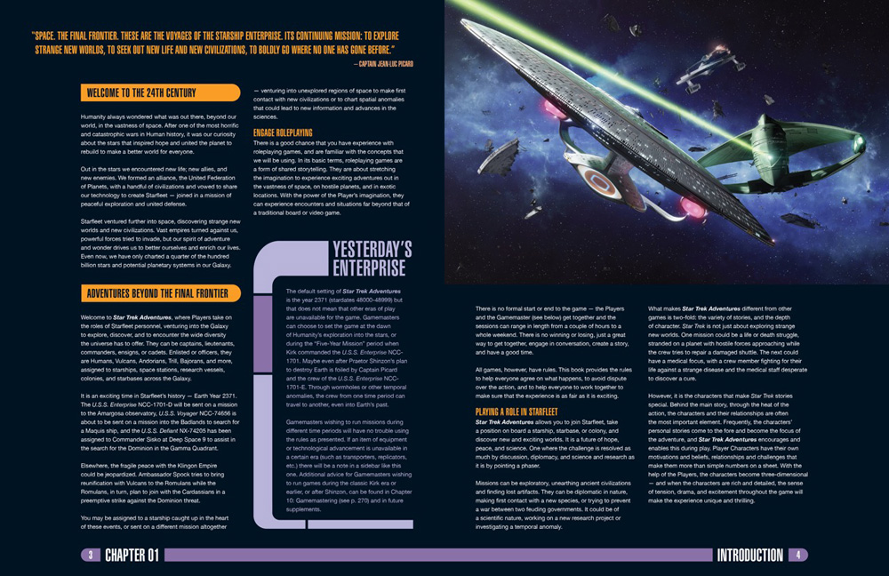
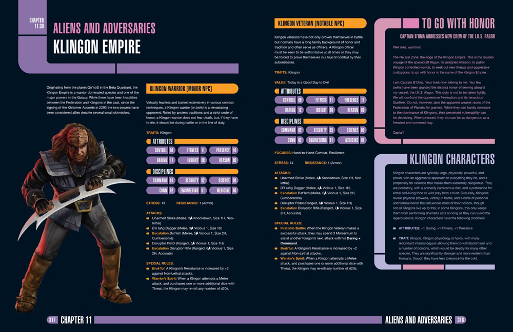 They feel like something right out of Star Trek!
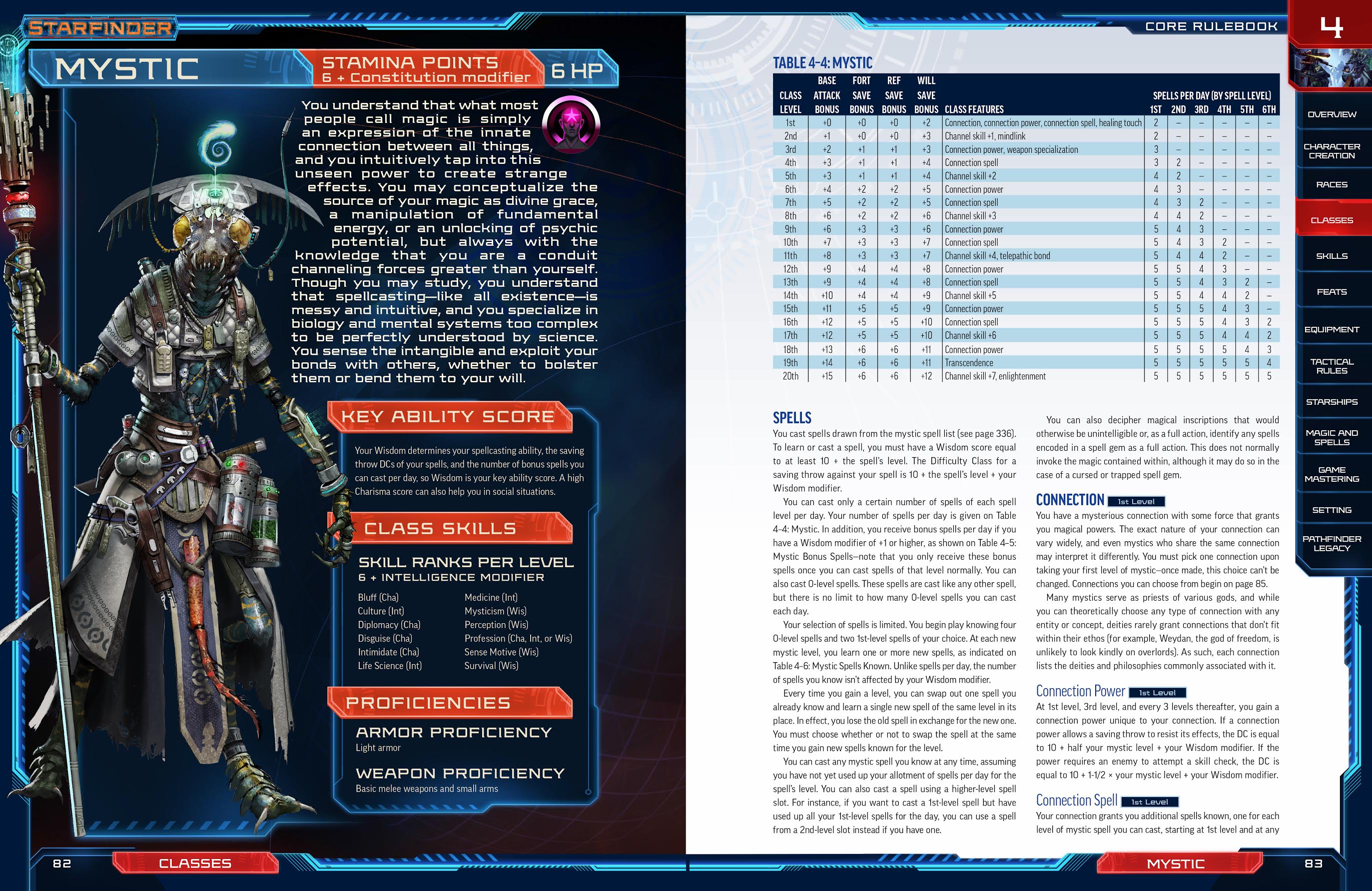
The recently released Starfinder is another example. I don’t have the hardcopy, but you can see the great layout on the PDF. Really didn’t expect any less form Paizo, but they have taken their expertise and taken it to the next level. Just look…
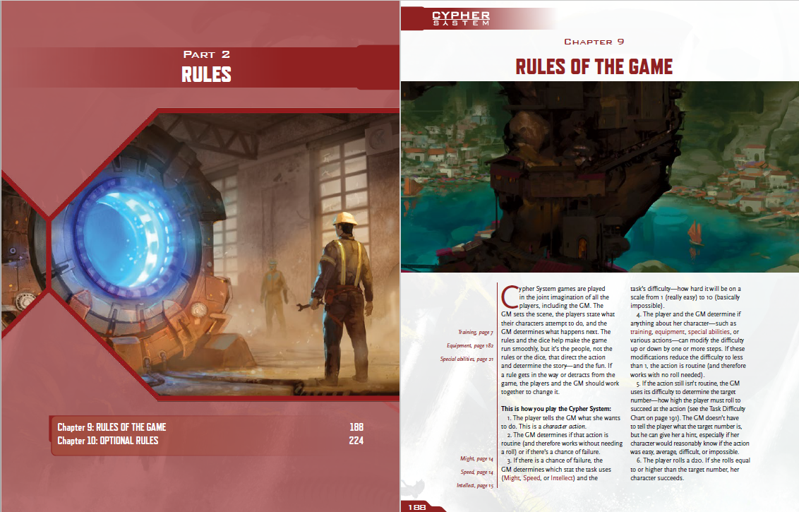
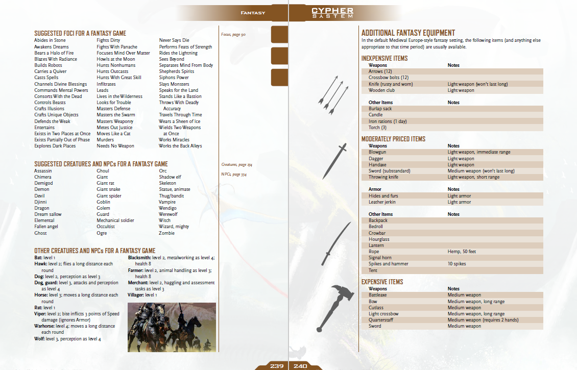
But my pick for true jaw-dropping layout goes to Monte Cook games! Their layout is no only elegant, easy to read, with generally great art, but the cross referencing, the rule clarifications and page references in the margins means that understanding the game and getting additional information when you need it is easy. This is style and function combined into one.
The companion to this series of posts are our vide responses to the questions of #RPGaDay2017 over at the Desde la Fosa YouTube channel. Me and the team at Desde la Fosa are recording our answers in Spanish. If you speak the language we appreciate the views, if you don’t, we are thankful for any shares.
Which is your choice for jaw-dropping layout? Let us know here in the comments or tag us in social media.

